Nice to meet you!
Word nerds, code bunnies, font addicts and vector wranglers... we're here to help your business shine online.

I've always been into words. I can't pinpoint the exact moment I knew I needed to be a writer-for-real, but the pull was more persistent than that of my previous aspirations.
(Age 6: Astronaut, Age 9: Archaeologist… there's still time).
That need saw me work in marketing, PR and editorial for a bunch of cool brands (Red Bull, UN Foundation, Dove, Intrepid Travel, Johnnie Walker) in a bunch of cool places (Australia, UK, Western Europe). It also saw my byline in the likes of Time Out, Huffington Post and Cosmopolitan (RIP).
But I've also always been into humans, and what makes them do what they do. What motivates, frustrates, alienates and drives people to act and react and stay loyal or shop around.
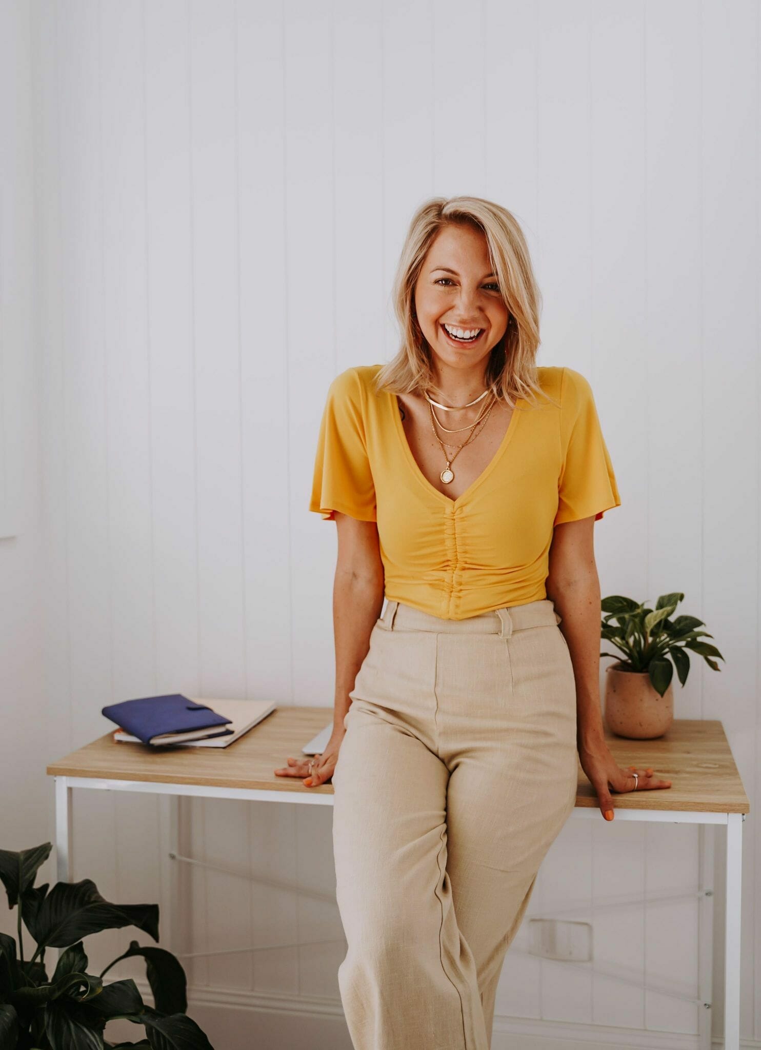
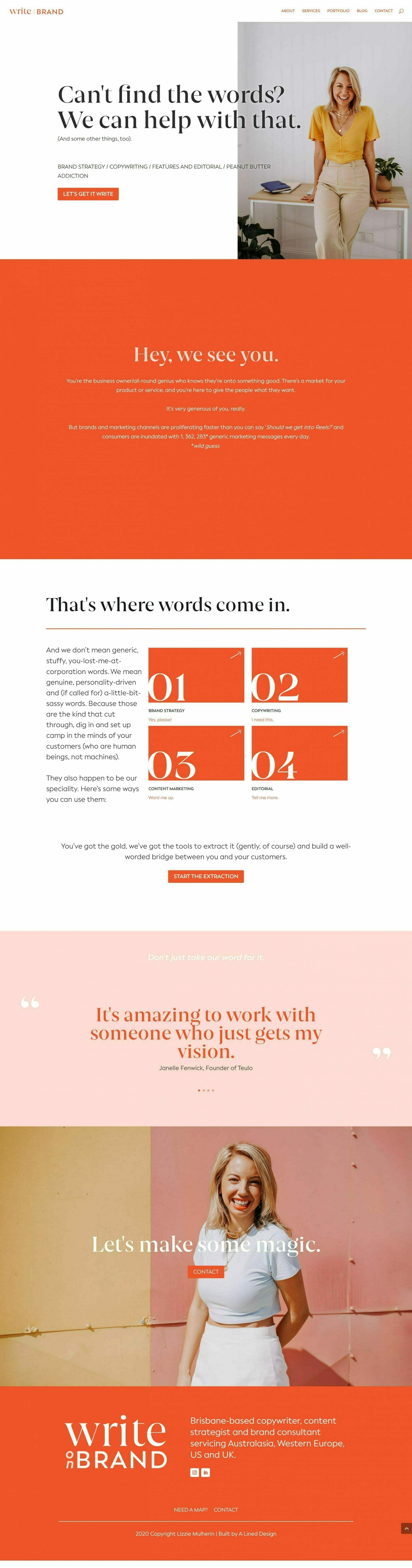
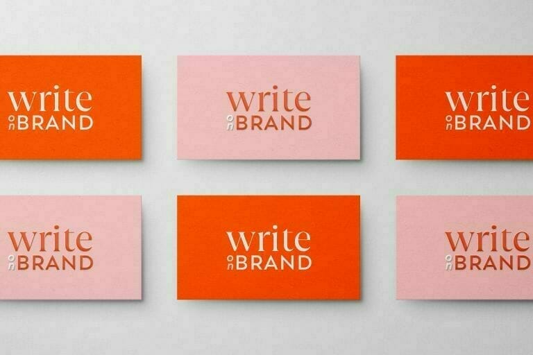
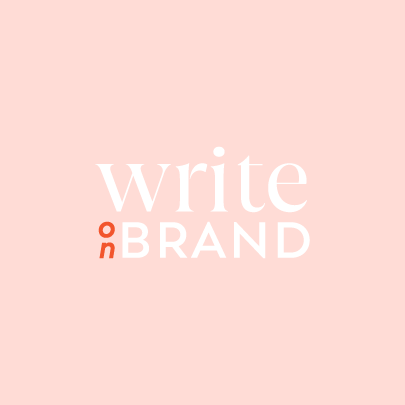
ORANGE. Yep, orange. Punchy, vibrant, unapologetic, positive orange. Absolutley perfect for Lizzie's writing style and brand vibe. With Chelsea Kiem, Lizzie found just about the BEST background for a brand shoot I've seen. So good!
Lizzie was keen to keep things simple and her reference material was typography driven (my fave!). Oh, the possibilities!

When I launched the site Sarah had developed, I gained 8 new clients and even more leads within 48 hours. I think that says it all! Sarah is dedicated, talented and a joy to work with. Highly, highly recommend!
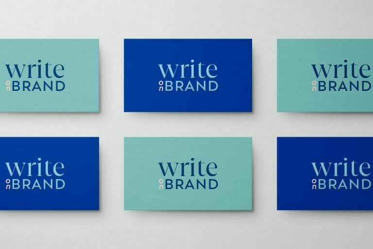
The fonts needed to be minimal but full of personality to match the power of the colour palette. We paired an elegant and warm serif with a fresh geometric sans serif, both of which jump off the page. The contrast and play between the two is brave like the colour choices.
We added two blues in an alternate colourway with a pink to link the two. Blue and orange are never seen together, except when a feature orange button is used on a dark blue background. No one likes too much pepper in the pot, after all.


Each page has either an oragne or blue theme, all using subtle animations, bold chunks of background colours, and fonts slightly oversized. IMPACT.

In today's digital age, having a strong online presence is crucial for businesses. That's why it's essential to work with a web development company that not only understands the technical aspects of building a website but also has a strong focus on creative design.
We specialize in creating custom websites that are not only functional but also visually stunning. Our team of experienced designers understands the importance of a website that truly reflects your brand and engages your target audience. From eye-catching graphics to intuitive navigation, we'll work with you to create a website that is tailored to your unique needs and helps you stand out from the competition.
So if you're looking for a web development company in Hobart, Tasmania, that prioritises creative design, look no further than our team of experts.